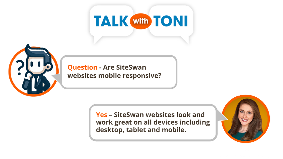
Question : Are SiteSwan websites mobile responsive?
Answer : Yes - SiteSwan websites look and work great on all devices including desktop, tablet and mobile.
In-depth Explanation:
In the ever-evolving digital landscape, ensuring that websites are mobile responsive is more important than ever. With the increasing use of smartphones and tablets to browse the internet, it is essential that websites deliver an optimal experience across all devices. At SiteSwan, we recognize this need and have designed our platform to ensure that every website created using our tools is fully mobile responsive.
How SiteSwan Ensures Mobile Responsiveness
At SiteSwan, we are committed to providing our resellers with a platform that delivers exceptional mobile responsive websites. Here’s how we achieve this:
• Automatic Layout Adjustment: Our platform utilizes flexible grid layouts that automatically adjust to fit various screen sizes and resolutions. This ensures that content is always displayed in a user-friendly manner, whether visitors are accessing the site from a desktop computer, tablet, or smartphone.
• Responsive Design Elements: SiteSwan includes responsive design features such as scalable images. These elements resize automatically to suit the screen they are viewed on, eliminating the need for separate mobile and desktop versions of a site. This approach simplifies maintenance and ensures a consistent user experience.
• Optimized Performance: We prioritize performance by ensuring that SiteSwan websites not only look great on any device but also perform efficiently. Faster loading times and touch-friendly navigation contribute to a seamless and engaging experience for mobile users.
• Preview and Testing Tools: SiteSwan offers tools for previewing how a website will appear on different devices. This allows our resellers to make any necessary adjustments and ensure their site meets high responsiveness standards.
The Benefits of Mobile Responsiveness for Your Web Design Business
Mobile responsiveness is crucial not only for user experience but also for the overall success of a website. Here’s how responsive design can benefit your web design business:
Enhanced User Engagement
A mobile-responsive site ensures that users can easily navigate and interact with the content, leading to higher engagement rates. Visitors are more likely to stay on a site and explore if it is designed with their device in mind.
Improved Search Engine Rankings
Search engines, including Google, prioritize mobile-friendly websites in their rankings. A responsive site can boost SEO performance and drive more organic traffic to your client’s website.
Broader Accessibility
By ensuring that a site is accessible across all devices, you can reach a wider audience and enhance overall accessibility. This inclusivity is crucial for engaging with today’s diverse user base.
Conclusion
At SiteSwan, we are dedicated to providing a platform that supports mobile responsiveness, ensuring that every website built using our tools delivers an excellent user experience on any device. Our focus on responsive design not only aligns with modern web standards but also enhances the functionality and reach of your web design projects. By leveraging SiteSwan’s responsive features, you can create high-quality, user-friendly websites that meet the demands of today’s mobile-centric world.
We'd love to hear from you!
Share your comments or questions using the form below.